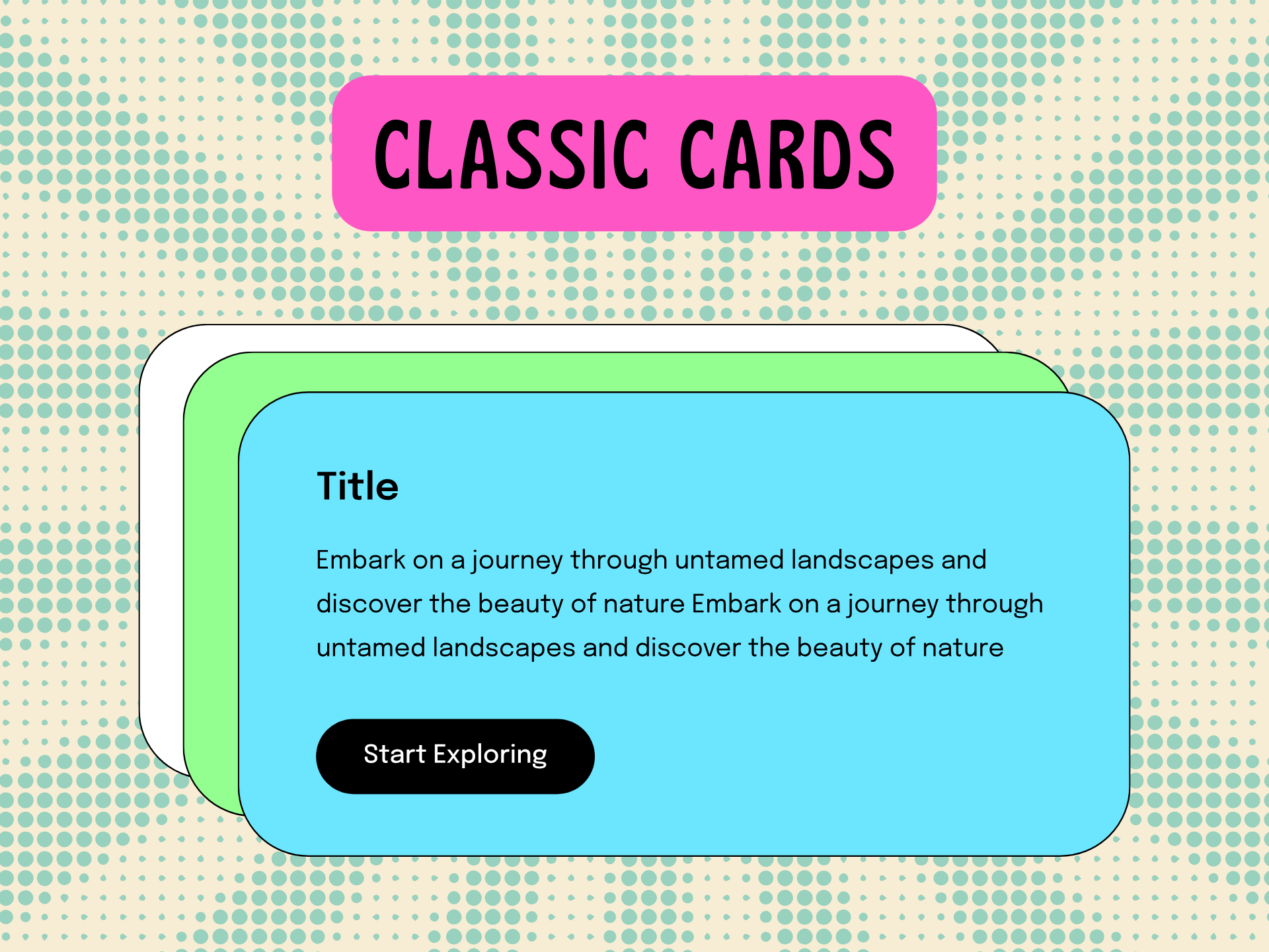
Classic Cards
The Classic Card module is a dynamic and customizable content block designed to enhance your website's visual and informational appeal
🎉 Celebrating Our HubSpot Platinum Partnership! - Get Our Services for $1499 $999 [ First 3 months ] – Limited Time Offer! 🎉
-1.png?width=134&height=66&name=amwhiz-logo%20(1)-1.png)
Below is a list of all the customization options available for the Classic Cards Module
Content
Drag and drop the Classic Cards Module into your desired location on the page.


Card text
Inside the card, you can add a title, description, and button
Card title and description
You can add a title and select a title tag as well. Tags range from heading1 to heading6

You can add a description

Button
The Classic Card Module supports two types of buttons: a lined button and a filled button. You can enable either a lined button or a filled button, but not both at the same time

You can add button Text & URL
Styles
Card settings: You can set
Card spacing
Card Background (Available options: Normal, Gradient, and Image
Card background color
Content Alignment
Border styles
Border color, width, spacing, and padding
Border radius

Title Styles
You can change Font, Spacing, Padding, and Text Transform

Description Styles
You can change Font, Spacing, Padding, and Text Transform

Lined Button Style
Button font
Button spacing, and padding
Text Transform
Border styles
Border color, width, Background color
Hover Background color and text color
Border Radius

Filled Button Styles
Button font
Button spacing, and padding
Text Transform
Border styles
Border color, width, Background color
Hover Background color and text color
Border Radius

Address
Greeta Towers, 99, OMR, Industrial Estate, Perungudi, Chennai, Tamil Nadu 600096.